UI Navigation🔗
Verity Workspace🔗
Verity Workspace is the "single pane of glass" through which you can configure Tenant Services, BGP gateways, Layer-3 instances, and apply these settings to network leaf ports.

Main Navigation Bar🔗
The Main Navigation Bar provides quick access to the different work areas in Verity:

Basic UI Navigation🔗
The Verity UI is designed to behave like Google Maps in that it uses a zoomable user interface. Panning and zooming is how you view sections in more detail. The more you zoom in, the more context is shown. You zoom in/out by scrolling with your mouse wheel or double clicking to focus on a section. A single mouse click lets you see one layer deeper without zooming in.
- Pan - Hold-click on any point of the map and move the mouse. Keyboard arrow keys also support panning.
- Zoom - Double-click on an object to go to a defined view. You can also drag and scroll the page to navigate. The + and - keyboard buttons also control zoom.
Navigation History🔗
To navigate forward or back you use the navigation icons.

To view your navigation history you click the history icon.


Navigation actions are also applied using keyboard commands by pressing SHIFT left arrow (back) or SHIFT right arrow (forward).
Icon Links🔗
Clicking Icons referencing related objects within a given pane moves the user to the referenced object where it can be viewed or edited. All icons are described in mouse pop up tool tips, this helps you learn the options as you become more proficient in using the UI.
Topology Navigation🔗
Network Representation🔗
The devices are described in visually descending order.
- Super Spines
- Pods
- Spines
- Leafs

Every spine connects to every leaf. For configurations where the number of leaf’s outnumber the ports on the spine, the network is broken up into Pods. The demonstration image contains three pods.
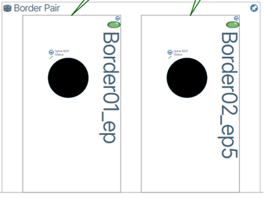
Leaf Pairs🔗
Leaf Pairs are represented by a border encapsulating the paired switches.
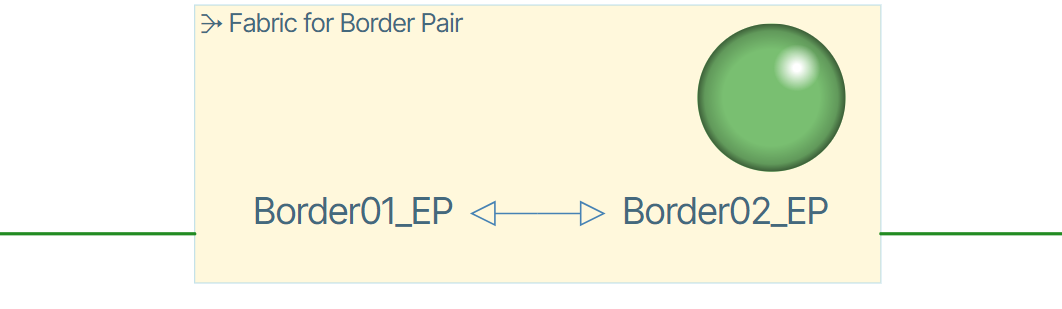
When zoomed in, the fabric connection is represented by the following image.
Color Connections🔗
The state of devices is depicted by colored connection lines. The available state is depicted by a green color icon, while the down state is denoted by red, provisioning by gold and unstable by yellow.
Toggle Color Connections of Leafs When in Topology/Topology you can toggle the visibility of connection lines by clicking the line visibility toggle button.

Buttons🔗
There are two types of buttons in the Verity UI, Regular buttons and Hex buttons.
Regular Buttons🔗
Regular buttons are scattered throughout the application and are used to perform different actions. If a button is not a Hex button it is a regular button. To perform an action with a regular button you left click it. There are many more regular buttons than those shown in the example above. A more detailed description of buttons is presented later in this document.

Hex Buttons🔗
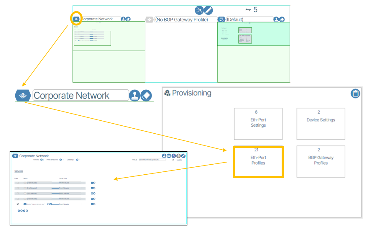
Hex buttons represent tangible objects such as switches or other devices and respond to both right and left click mouse button actions.

Clicking a hex button causes the window view to center on the Hex button container. Right-clicking a hex button gives you additional options that apply to the object.

Jumping Views🔗
When you click the hex button a window “jump” is performed moving your view to the respective Provisioning section of the application. In the example below, a “jump” is made to the Eth Port Profile after clicking the hex button.
Navigation Depth Tracker🔗
On the top left of the screen, there is a navigation depth tracker. You can click on the level you would like to directly navigate back to. An example is shown below.

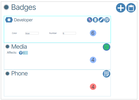
Badges🔗
Badges are used to group devices visually.
Network View🔗
The Network View window resides inside the Topology and displays virtual devices and connections that represent hardware devices in the physical network configuration.

Search Workbench🔗
Search Workbench is used to search objects in the UI.

Jump Workbench🔗
To quickly jump to an area in the UI, the user can use the Jump workbench and click on the listed sections: Hardware, Provisioning, and Endpoint Collections. By clicking the arrows, the user can access different sections of the UI by clicking on the options in the dropdown.

Growl History🔗
Growls are errors that occur between the client browser and the Verity orchestration platform. Holding the mouse over the growl gives the user more detail about the error. The Growl history can be viewed at Alarms/Growl History.

Alarms🔗
Alarms are notifications that inform the administrator about changes to the network state. These notifications are displayed in the Events view under the Active Alarms tab.

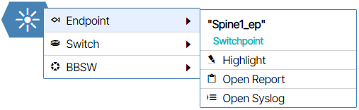
Highlighter🔗

Highlighter  is a powerful tool for tracing an object usage anywhere in the UI. It is shown within the various objects and at the bottom center of the map. When you use the highlight tool, a purple hue is applied to the selected object. The user cannot use highlighter in the world view.
Groups🔗
Provisioning Objects can be organized into collections called Groups. Groups do not affect the behavior of Provisioning Objects and are used only for aesthetic and organizational purposes.
How to Create Groups🔗
Open the tile of an object that you want to include in a group. In the example below, a Service tile is used.
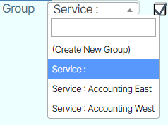
The upper right corner of the window contains a field named Group.
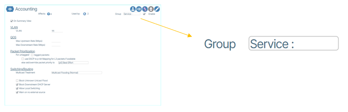
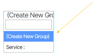
Double-click the field to edit it. Click Create New Group.
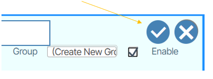
Click the checkmark button.
A window appears prompting you to name your Group.
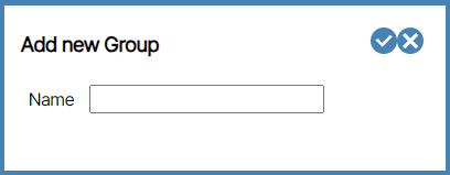
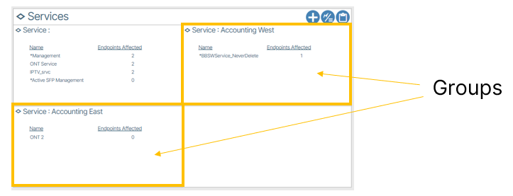
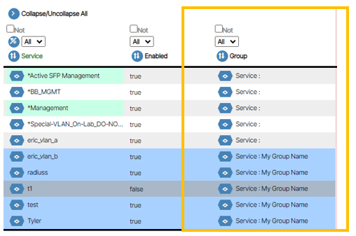
Type and submit a name by clicking the checkbox button. The Service is automatically placed in the Group. Any Groups you create are available in the Group drop down menu. As an example, the following image contains 2 custom Groups, one named Accounting East and the other named Accounting West.
The parent tile window renders a new tile for each Group.
Creating Groups from Reports🔗
Groups can be created via the Reports window. To do this you need to first navigate to the Reports window of the object(s) you want to group.
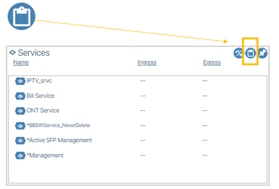
Here, Actions are used to create Groups. To create a Group using Actions, click Actions, click Set Group, name the Group, click Accept Changes.
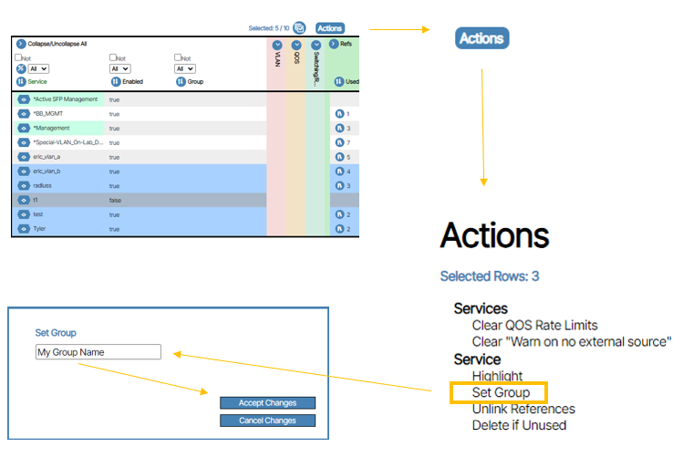
Note
Action menus differ between objects. Depending on your selection, the Set Group option may appear differently (e.g., "Set Bundle") or not at all.
The changes are made and visible in the Group column.
Default Objects🔗
Windows throughout the application that are used to edit device parameters have a default object. This object is displayed in light-green and is editable.
